Design arguments usually turn into taste arguments, which nobody wins. These seven are not matters of taste. Each one is a specific reason a visitor who wanted to contact you did not, and each one has a fix that takes hours rather than a redesign.
1. Slow on a phone
Not slow on your laptop on office broadband. Slow on a four-year-old phone, on mobile data, on a street. That is where trade websites get opened. The usual culprits are uncompressed photographs straight off a camera, a carousel nobody asked for, and five tracking scripts.
Test it on your own phone with wifi turned off. If you find yourself waiting, so did every visitor you lost.
2. Unclear what you do
Homepages often open with a mood, a wide photograph and a slogan about excellence, and state the actual trade somewhere further down. The visitor has to work for the one piece of information they came for. Say the trade and the area in the first line.
3. A phone number you cannot tap
If the number is baked into an image, or lives only in the footer, you have put a step between deciding to call and calling. It belongs in the header, as a real link, on every page.
4. A form that asks too much
Company name, budget range, how did you hear about us, preferred contact method. Every one of those is a small reason to stop. Collect what you need to have a first conversation and get the rest during it.
5. Silence after the form
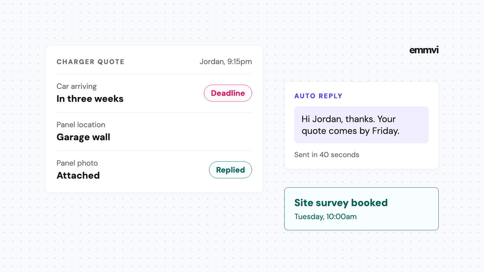
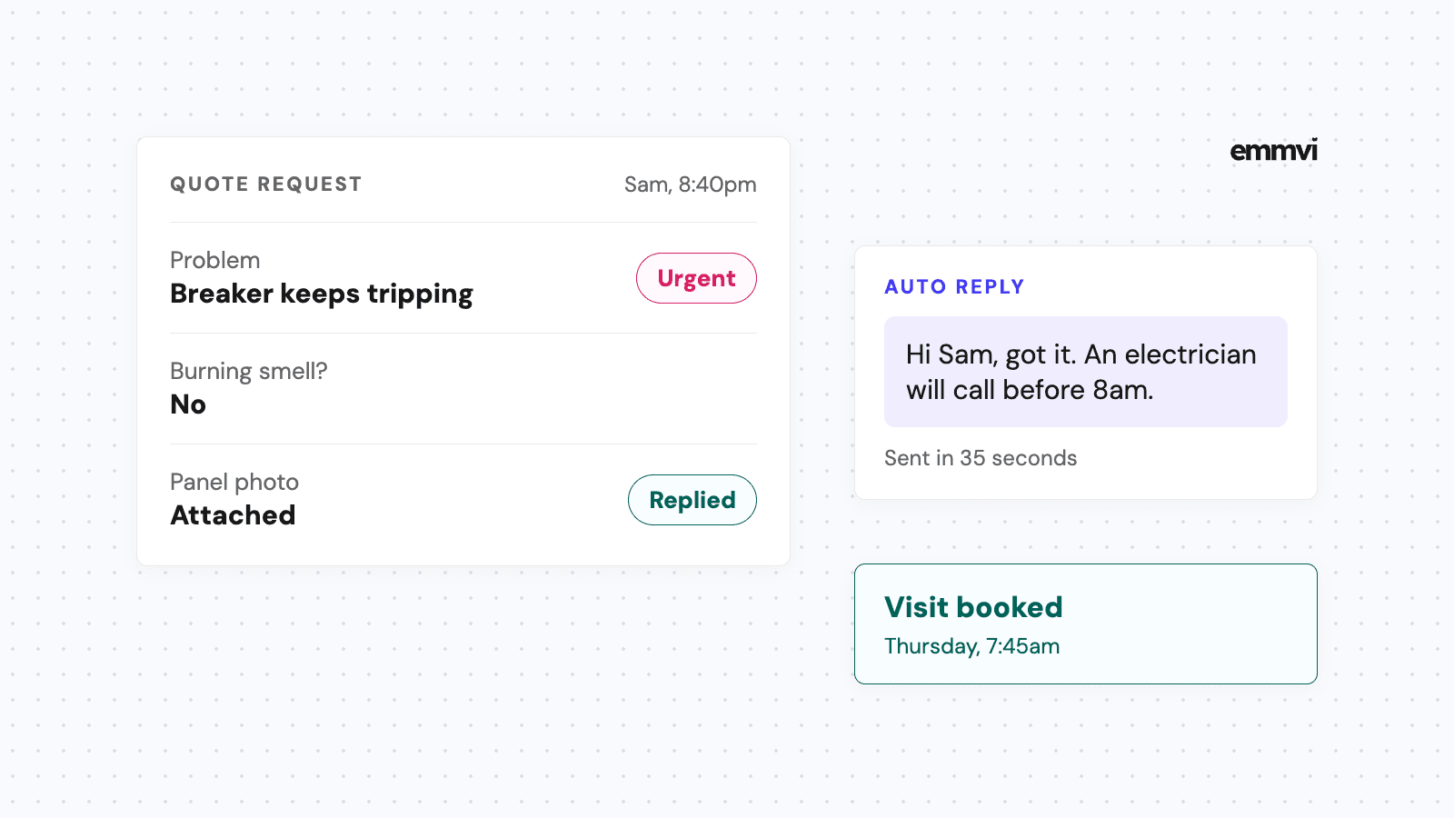
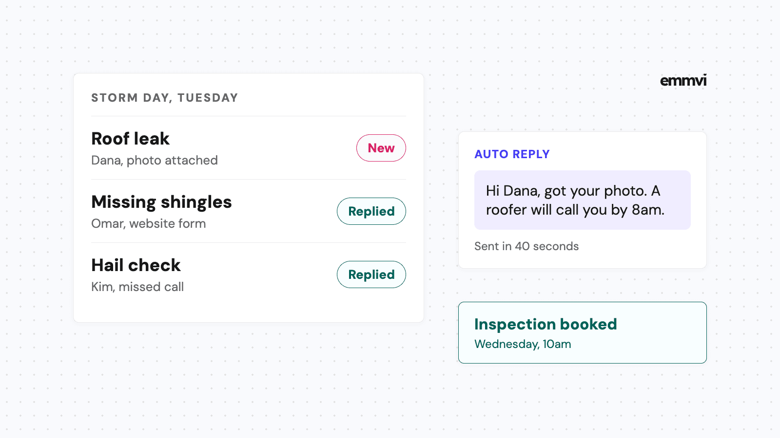
This is the one nobody counts as a design problem, and it costs more than the other six together. The visitor submits, sees a thank-you line, and then hears nothing until someone gets round to the inbox. Meanwhile they have sent the same quote request to two competitors.
How fast the first reply goes out has a name in sales, speed to lead, and it is the cheapest of the seven to fix.
The page is the easy half. The half that decides whether the quote request becomes a job is what happens in the hour afterwards, and that is not a design decision. It is a system you either have or do not.
6. Generic proof
Stock photographs of people in hard hats who are not your team. Logos of companies you did not work for. Testimonials with no name attached. A visitor cannot verify any of it, and the ones who notice trust you less than if you had shown nothing.
Three real photographs of your own jobs, with the town named, beat any of it.
7. Pages that end nowhere
A visitor reaches the bottom of a service page and there is nothing to do. No contact form, no number, no next page. They go back to the search results, which is where your competitors are.
Every page should end with the same obvious action. It does not have to be clever. It has to be there.
The order to fix them in
Five, one and three, in that order. What happens after the form is sent, then speed, then the tappable number. They are the cheapest and they move the most. The rest can wait for the next round.
Share the post: